MAGAZINE LAYOUT & AD DESIGN
As a Senior Graphic Designer at Media Index Publishing, my responsibilities include editorial design, color correction, cover design, gift guides, calendars, preflight processes, and ad creation. I maintain organization by using a monthly production sheet to track advertisements for four different magazines.
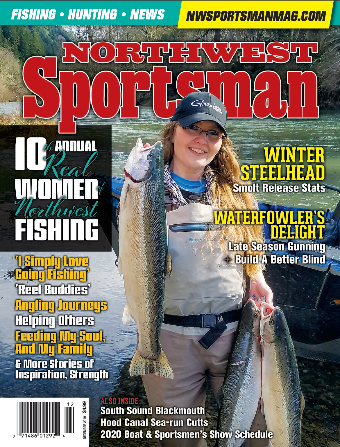
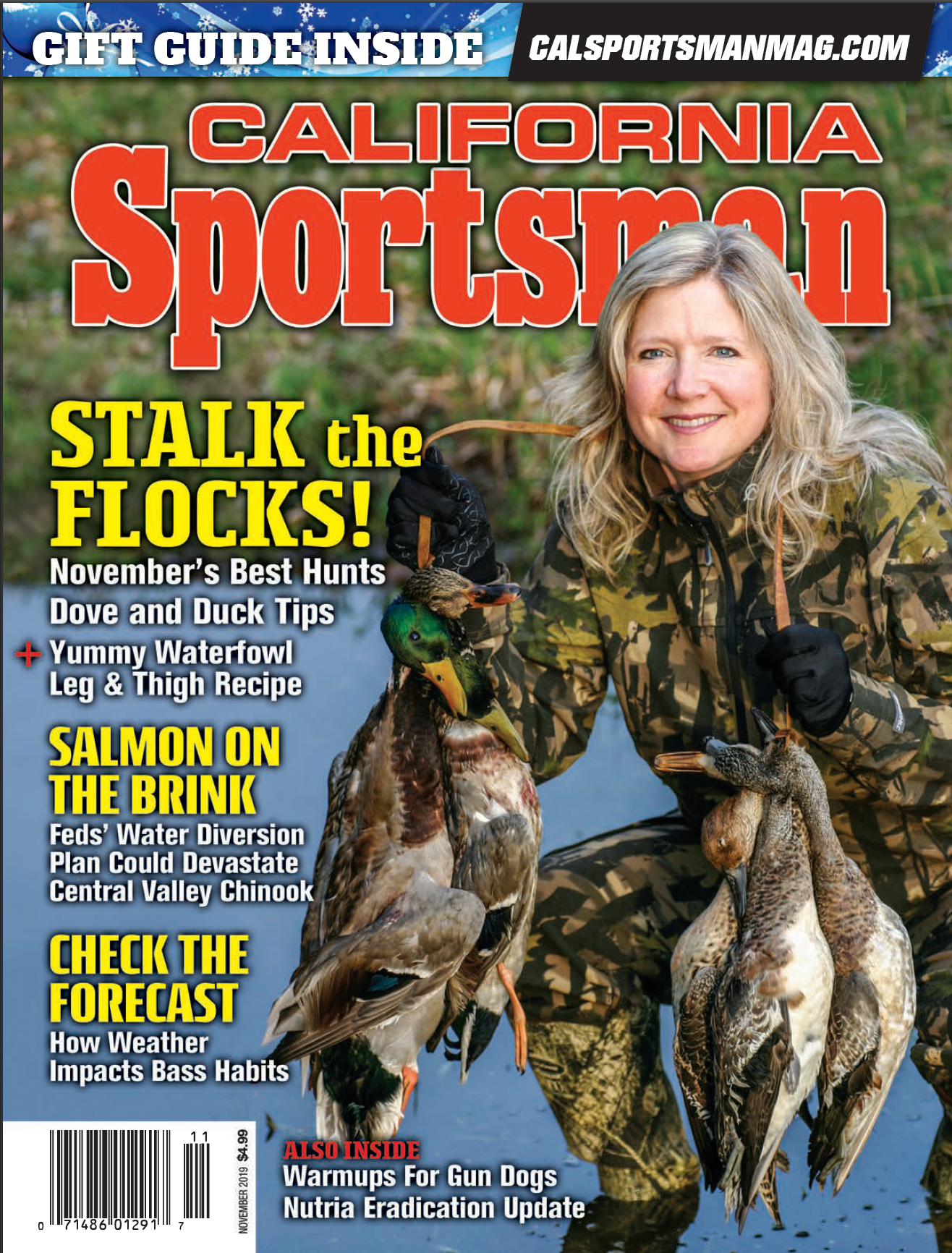
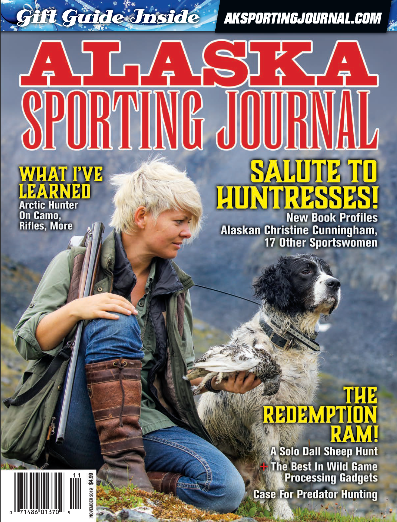
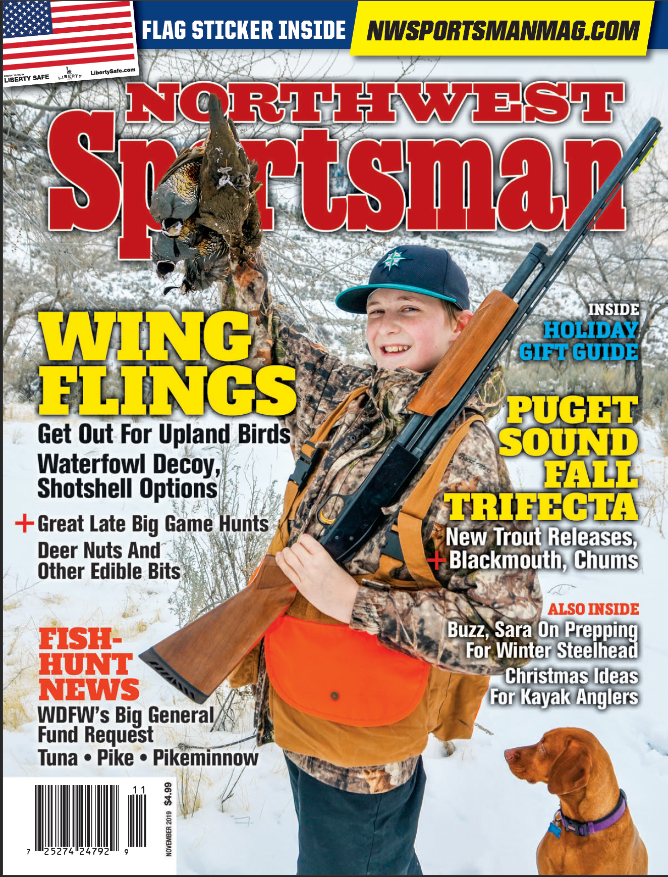
Below is a preview of several magazine covers and an editorial layouts. I utilize Adobe Creative Suite, including Photoshop, Illustrator, and InDesign for both print and web tasks. For video editing, I work with After Effects and Premiere Pro. Additional samples are available upon request.
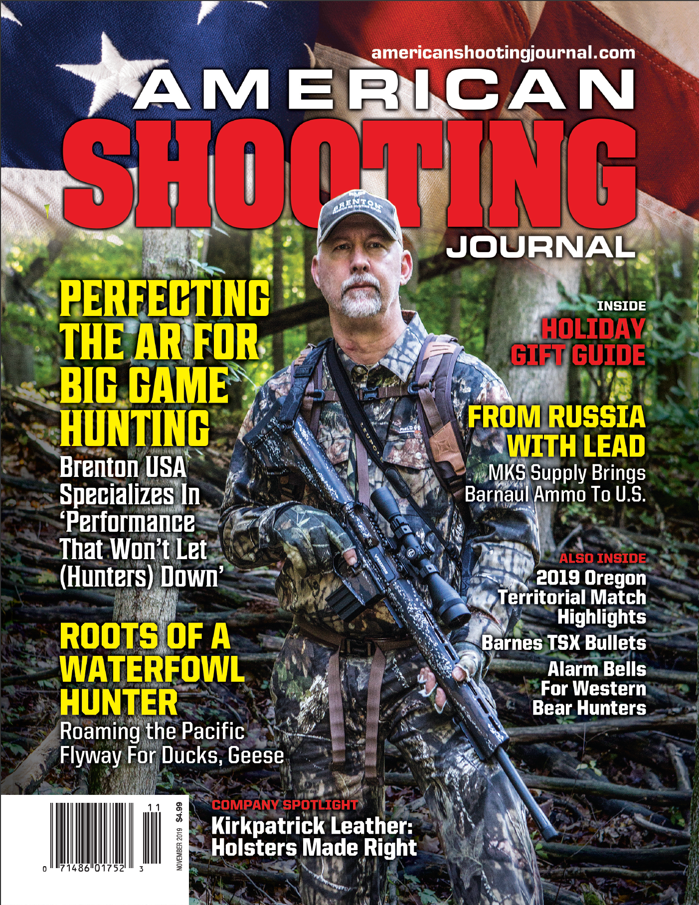
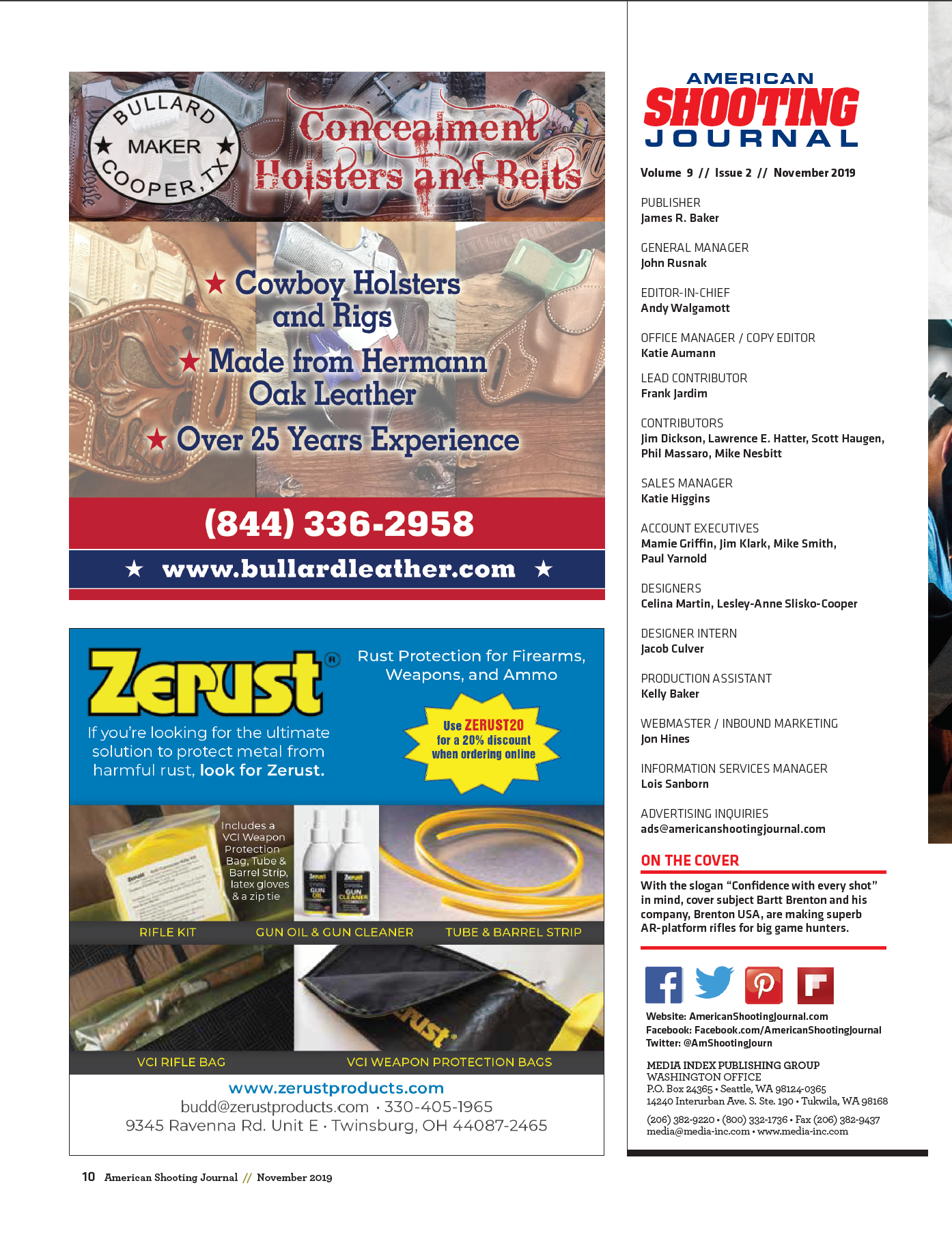
COVERS, EDITORIAL LAYOUT & AD DESIGN
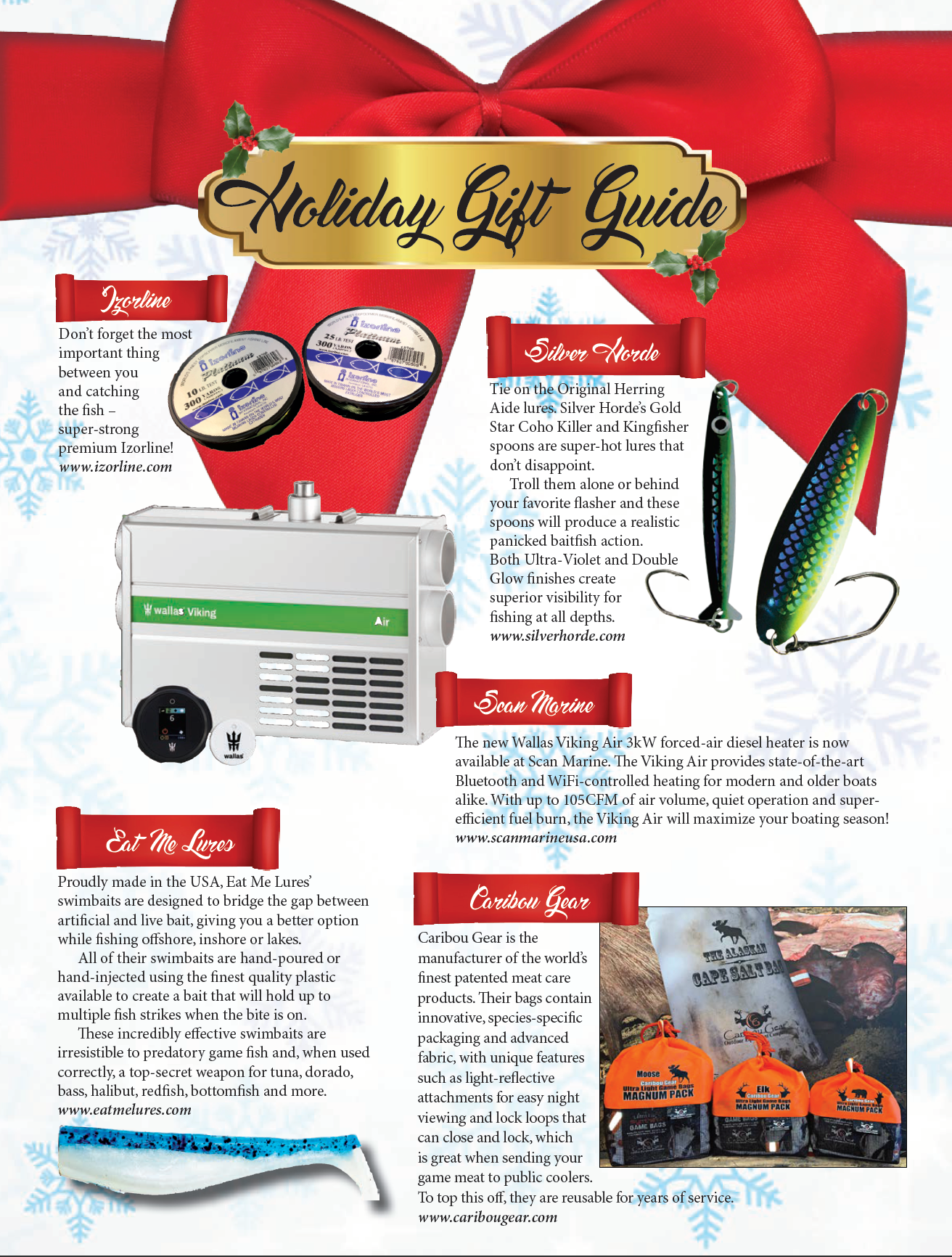
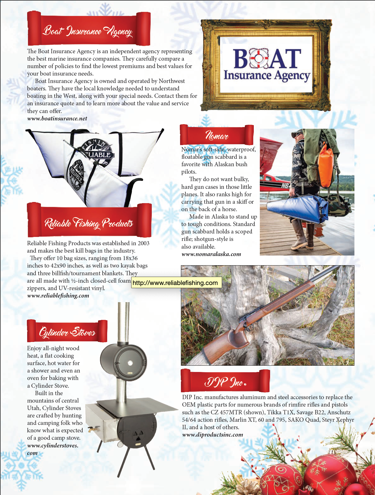
Gift Guide
Editorial

Columns
Advertorial
Advertorial
Ads
MAGAZINE CALENDAR & AD DESIGN
MAGAZINE REDESIGN PRINT & DIGITAL
BEFORE
InDesign has enabled me to create traditional and non-traditional layouts. In classic magazine and book layouts, I have been able to create clean designs with the use of character styles. I stepped things up and decided to create an interactive magazine with moving elements and fill-in text boxes.
The first issue below is an interactive version of the magazine about glamour and transformation. A promotional piece in magazine style, this design encourages the viewer to interact. The remaining examples showcase the magazine in a print layout that allows people to view via a link online. The use of page swipes and floating titles adds a simple element to engage and entertain the viewer; to give the viewer a different experience and grab their attention. Click to view.
AFTER
Redesigned and retitled as Dirty Glamour Magazine, a magazine about glamour and transformation. The models are transformed using digital imagery to dream worlds. With a concentrated focus on simplifying the design due to the complicated images, this magazine is an opportunity for me to create a clean imaginative framework to be reused for every issue.
I had the opportunity to design the layout for both print and interactive. Each issue is a progression in design. I streamlined the title to easily fit every issue and reflect a modern but retro edge. As the magazine evolves so does the design. Click to view.
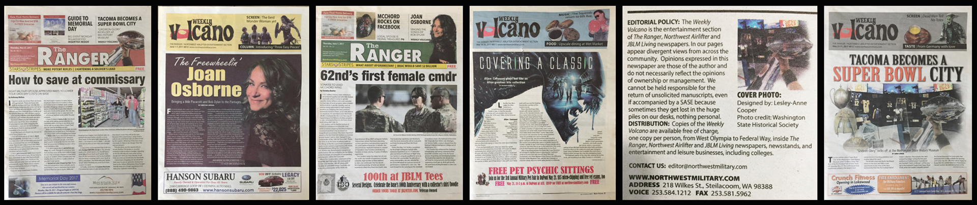
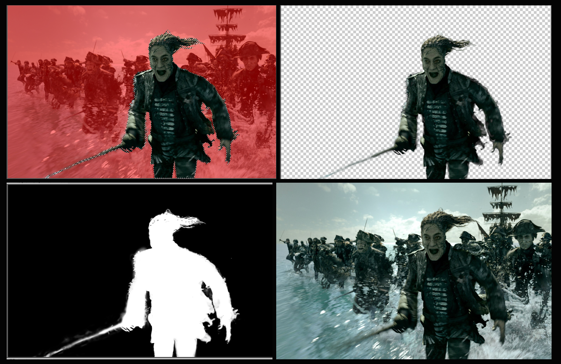
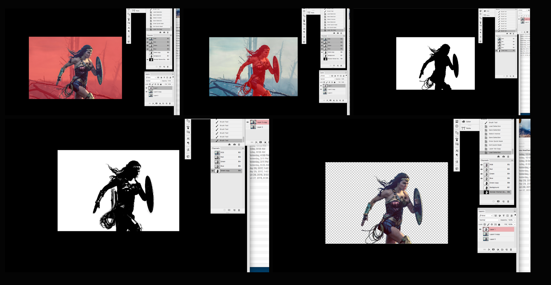
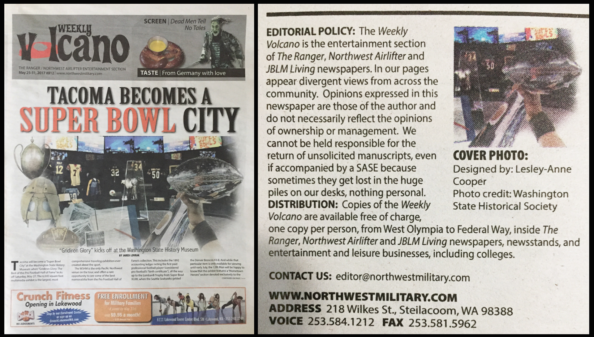
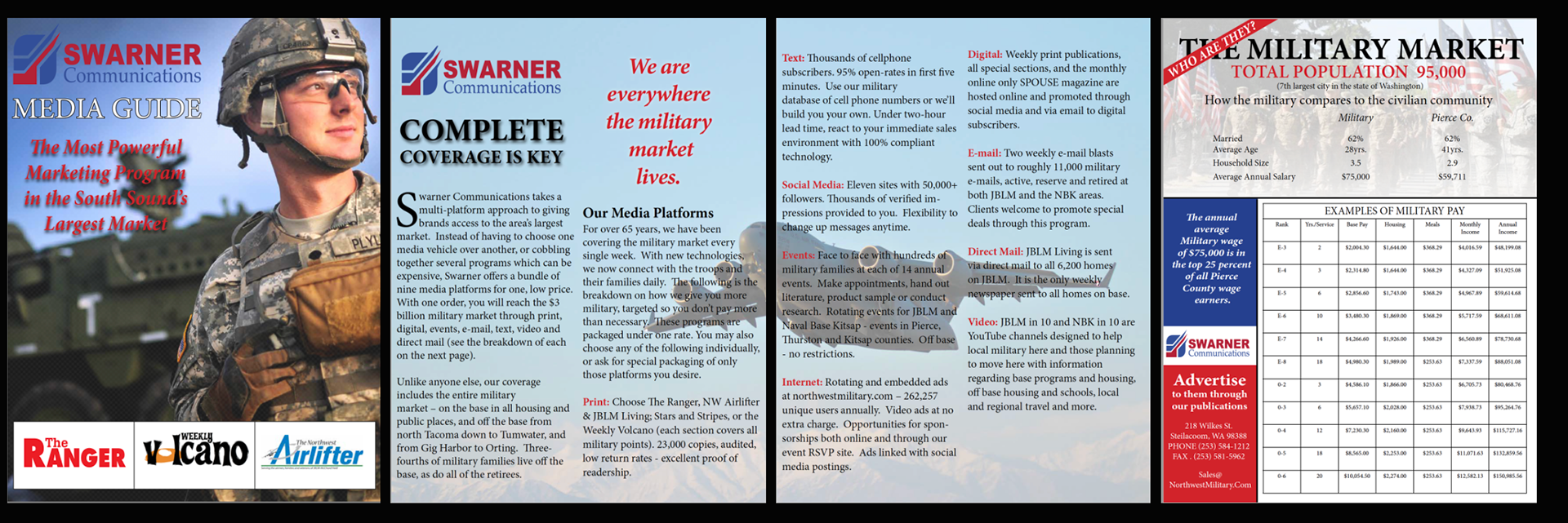
Applying my skills and passion for channels and masking at Swarner Communications, which includes Northwest Military, The Volcano, The Ranger, and The Northwest Airlifter newspapers.
I created a work journal to document my semester’s independent study, detailing my processes and workflows, from the project focused on mastering channels to my experiences interning at Northwest Military.
By concentrating on channels and masks for my independent study, I was able to refine my skill set. The hands-on experience I gained during my internship complemented this focus, reinforcing my abilities in both areas.
The Process
Working with Swarner Communications was a rewarding and invaluable experience that provided me with valuable insights into the publishing industry. I contributed to various newspapers in multiple capacities, from complex image manipulation to layout work to covering for vacationing staff. Through this work, I became familiar with Northwest's publishing and layout procedures.
I utilized channels and masks for image manipulation to enhance images for front page covers. Additionally, I shared my expertise in these techniques with the staff, helping them learn new methods for isolating subjects and refining images. This experience aligned perfectly with my independent study, where my goal was to master these techniques.
Cover Design with credit
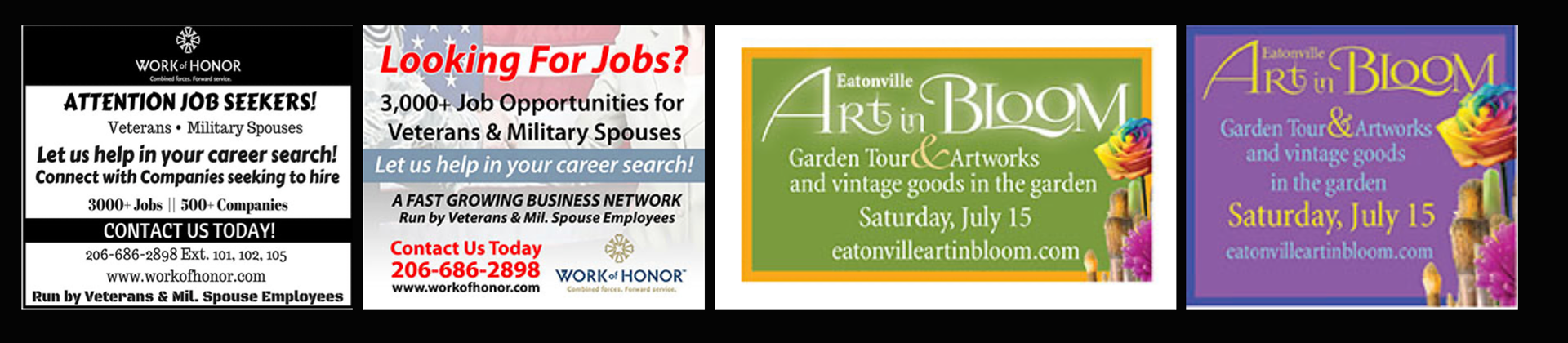
AD Designs

Before and After Ad Redesign
Media Guide Design
MAILER
Three Panel Flier and Business Card
The Process
Designing for print differs significantly from web publishing. In this project, I created a printable flyer for direct mail. I adhered to guidelines established by the United States Postal Service, as many designers may not be aware of the services they offer to prevent advertising pieces from being returned.
By utilizing these services, I was able to review my design and ensure compliance with standards that are effective for any design. Key elements, such as the placement of the return address and the document's size, are crucial when creating direct mailers. Failing to follow postal standards can lead to the piece being returned, which is not only disappointing—especially when working on a tight timeline—but also costly due to lost postage.
The business card was designed to resemble a circus ticket, attached with clear glue dots. Upon opening, the first panel reveals the ticket, the next panel presents a statement, and the final panel showcases the logo and images, creating a “wow” effect for the recipient.
After sourcing quotes for quantity and selecting an appropriate paper, the document was prepared for print. I provided the printer with a high-resolution PDF after meticulously checking the document for accuracy. As a precaution, I packaged the fonts as a backup, and the flyer and business card ticket were printed using a letterpress.
I emailed the files to the printer, and once completed, I visited the print shop to inspect the quality. Conducting preflight checks and reviewing the printed pieces are essential steps to ensure the final product matches the original design.
BUSINESS CARD
Introducing a fresh take on a classic concept, the business card is designed in the shape of a circus ticket. While the design is more intricate than traditional elements, it effectively utilizes white space to guide the eye across the card and to its reverse side. The card is a standard business card size, doubled, allowing it to fit seamlessly into the fold-out flyer.
Embracing white space provides a sense of safety, while taking creative risks is crucial for standing out and fostering innovation. Clients desire their companies to be distinctive. By offering them engaging and dynamic design options, we create a range of possibilities that inspire clients to envision unique opportunities for their brands.